Making data visualizations accessible

Share
Data visualizations are a valuable tool for conveying complex information. But they often aren’t accessible to people with disabilities. Here’s how Perkins Access made a data visualization about the leading cause of childhood blindness accessible.
When the CVI Center at Perkins set out to illustrate the prevalence of the leading cause of childhood blindness, CVI (Cortical Cerebral Visual Impairment), they knew it had to be accessible by folks with visual impairments and disabilities. So they partnered with Perkins Access.
CVI by the numbers is a first-of-its-kind presentation of multiple types of information, including stories from young people with CVI, data m-enavisualizations illustrating research on undiagnosed cases, information on CVI care providers across the U.S., an explanation of social risk factors, and the steps needed to improve outcomes. The research was conducted by the CVI Center at Perkins with data analysis support from the Data Viz Lab at Mckinsey and company.
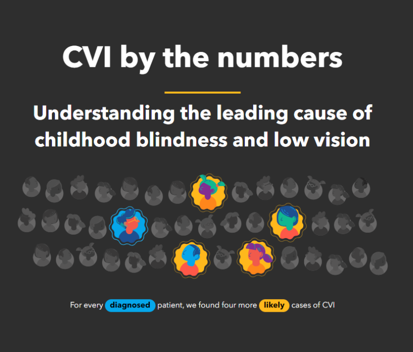
CVI is the leading cause of childhood blindness and low vision. Despite its prevalence, CVI is infrequently recognized and significantly underdiagnosed.
Crafting an engaging and compelling presentation of these stories and research findings helps raise awareness about CVI and improve how it is understood. An essential part of making this information available to a broad audience is ensuring the presentation does not introduce accessibility barriers for people with disabilities.
Most accessibility considerations built into CVI by the numbers apply to data visualizations and visual storytelling, which often fall outside the reach of automated accessibility tools. Perkins Access worked to provide custom solutions for reduced motion support, instructions for users, and descriptions for visually apparent patterns.
Reduced motion support
Stories from young folks with CVI animate across the screen as users move between slides. The maps showing CVI diagnosis data, likely cases, and estimated total CVI prevalence have a “scrollytelling” effect, where elements change their appearance based on a user’s scroll. Both of these visual treatments aim to make the content more engaging.
Some users experience distraction or nausea from animated content. The impact of animation on people with vestibular disorders can be quite severe, including nausea, migraine headaches, and potentially needing bed rest to recover. To reduce potential user discomfort, the page considers both explicit and implicit user preferences.
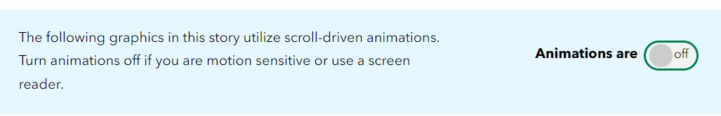
Near the top of the page, there is an explicit animation control. Users can turn off animations for the page directly. Separately, the page looks for a reduced motion preference set by a user at the operating system level. If this implicit preference is identified, animations automatically turn off, and the animation control switches off. Importantly, this smart feature happens without requiring any user action on the page.
Many people visiting the page may not be aware of a system-level setting for reducing motion. Providing those users explicit controls to turn off animation and respecting system settings is a robust way to accept a user’s preferences.
Instructions for use
Not everyone is familiar with interpreting data visualizations. Instructions guide users, helping them understand how to interact with the visualization. Instructions can also empower the user to engage more deeply with the data.
CVI by the numbers provides “How to read this chart” content for each map. Operating instructions are complemented by describing the meaning of visual changes that come from interacting with the map.
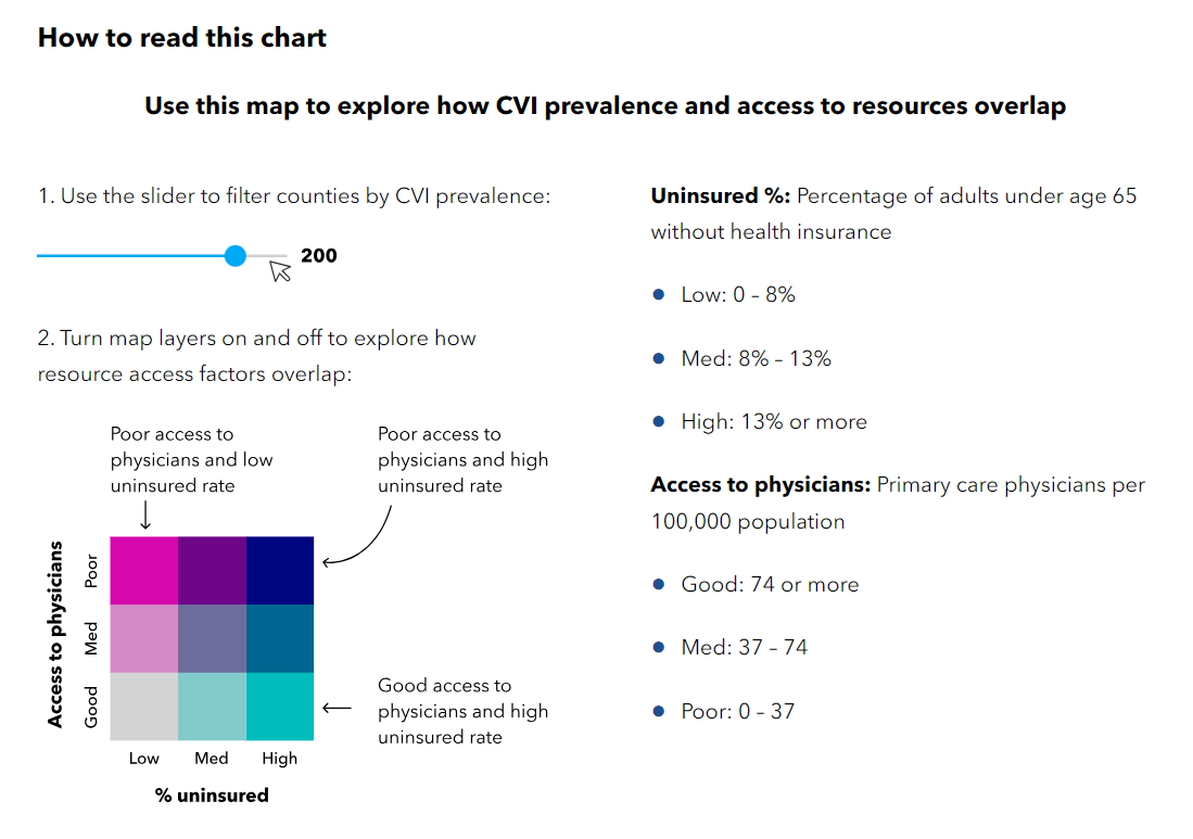
Beyond comprehension, providing instructions can also impart a sense of diligence and thoroughness on the creator’s part, which can increase the users’ trust in the visualization.
Descriptions for visually apparent patterns
Each of the United States maps on CVI by the numbers illustrates geographic clusters, variability, and patterns. Users with visual or cognitive disabilities may not be able to consume and interpret the maps through visual means.
To reduce this barrier, each map is accompanied by a clear, concise, and objective text description of patterns identified by the data. For example, the map that illustrates access to resources in high CVI areas includes the following text description:
“Below, we identified areas with disproportionately fewer physicians per 100k people and high rates of uninsurance. In these areas, there might not be enough resources or pediatricians who know about CVI to help all the children who need it.
In counties with high estimated CVI prevalence, there is no clear pattern to the rate of physicians per 100k; however, most counties with higher estimated CVI prevalence tend to have medium to high rates of uninsurance. In Texas, Oklahoma, and the Southeast, most counties have both poor physician access and medium to high uninsurance.”
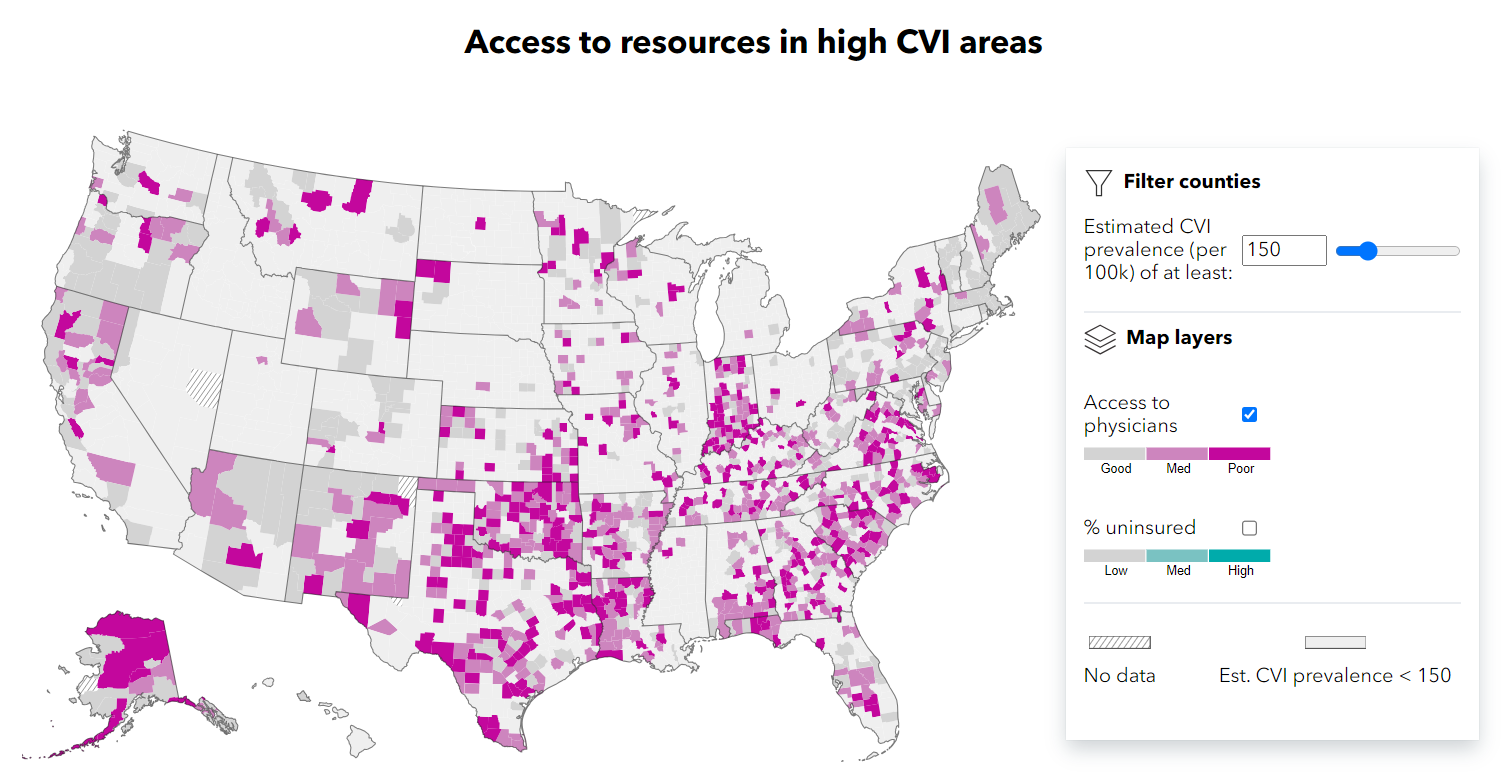
The description remains objective and is based on what is visible rather than making unsupported assumptions or inferences. In this case, the description acknowledges a lack of clear patterns for a given data set, which is valuable context.
Accessible and adaptive data visualizations
As the world has become increasingly data-driven, ensuring that all individuals, including those with disabilities, can access and understand visual data representations is crucial. In the past, many visualizations like charts, graphs, and infographics were primarily designed for visual appeal, often overlooking individuals with visual, motor, or cognitive disabilities. The techniques described above and other foundational accessibility considerations, such as appropriate contrast, keyboard support, and thoughtful semantics for assistive technologies to consume, are key to engaging more individuals.
Beyond respecting user preferences, a growing trend is increasing the adaptability of visualizations. Instead of creating a one-size-fits-all visualization, organizations are creating adaptable visualizations that can be adjusted based on a user’s needs or limitations. For instance, a graph might allow users to adjust contrast levels, switch between color schemes, or choose alternative forms of data representation like sonification (where data points are represented as sounds). With advancements in technology, there has also been a rise in the use of AI-driven tools that can automatically adjust visualizations based on the user’s profile or preferences.
Used with intentionality and care, these tools and techniques can lower accessibility barriers. When data is universally accessible, it drives better decision-making and knowledge dissemination for everyone.
Tell your story with data in a compelling and accessible way
When you build accessibility into your digital storytelling and data visualization projects, you make information approachable and understandable to a broader audience. Perkins Access can help your organization plan, design, and build a more accessible data visualization experience. Get in touch with our team of experts to learn more.