Proof: Accessible websites can be beautiful too
Share
How we made the new Perkins Access website as accessible as possible, and gorgeous too.
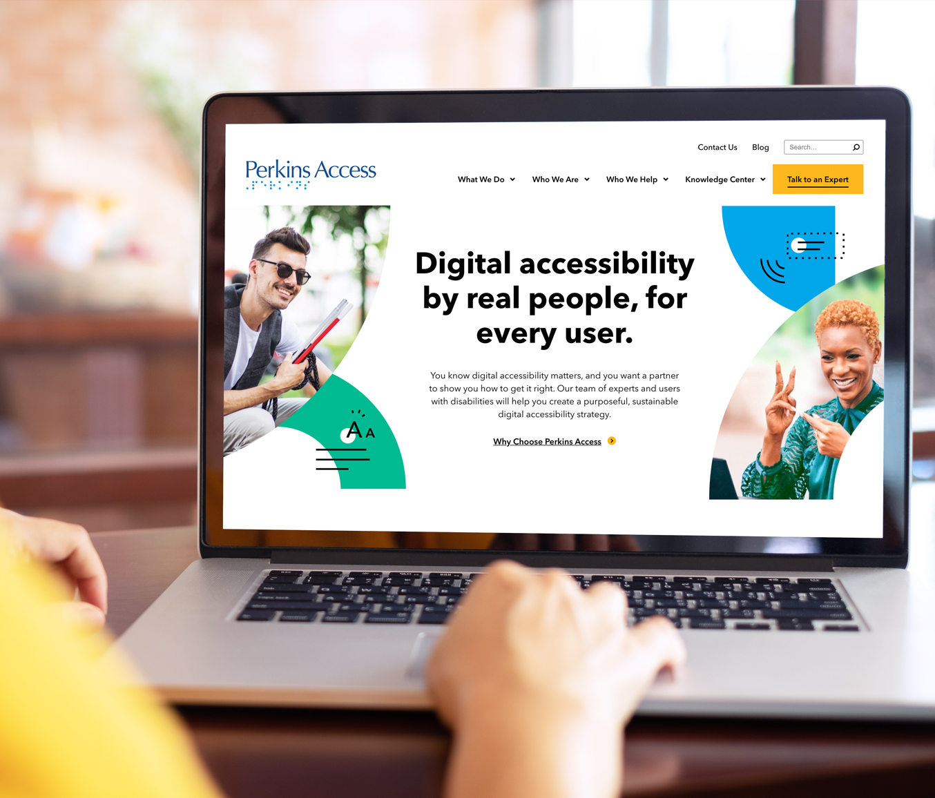
When people ask us for digital accessibility help, they’re often worried that improving the accessibility of their website will mean sacrificing aesthetic appeal. When we set out to redesign our own website, one of our goals was to prove just the opposite. Inclusive design doesn’t have to be boring or clunky — in fact, it can be gorgeous.
“Our goal was to create a site where the highest standards of accessibility and beauty meet. We developed the Perkins Access site to be fully usable by people with a range of abilities, including users of assistive technology. And we designed it for engagement and conversion. By prioritizing accessibility and inclusive design, we were able to create a richer and more intuitive experience for everyone.”
– Stephanie Wagle, Director, Digital Strategy, Perkins School for the Blind
Planning accessibility from the start
To make it happen, we knew we needed to bake accessibility into the process right from the start. Our accessibility expert, Gary Aussant, worked in close partnership with our team and our design and development partners at Vital Design starting with discovery, requirements gathering and design concepts. The devil is in the details when it comes to accessibility and Gary’s careful guidance helped ensure we did all the right things when it came to color choices, link styles, mouseover/focus states, photography choices and more. He also advised the team on how to build certain functionality so it would work effectively for screen readers and keyboard users alike.
“There are certain things designers and developers think they can’t do because of accessibility. But it turns out, if you code it right, you can create a modern and engaging experience that’s better for users of screen readers, keyboard users and sighted users,” said Gary Aussant, Director, Accessibility Consulting at Perkins Access.
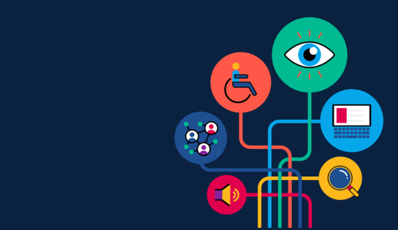
Choosing yellow and our vibrant color palette
Color is always an important consideration in inclusive design. For people with low vision or colorblindness, color contrast is critical, particularly where color is used to convey information. This was top of mind for us as the page designs were developed. And, like any organization, we had brand standards to consider. We needed to use the Perkins School for the Blind color palette, while also creating a look and feel for Perkins Access that was distinct from the perkins.org website, which is being overhauled as well.
The new design accomplishes both. Our partners at Vital created a gorgeous, vibrant color palette of blues and greens, alongside a bold, dark yellow for CTAs and mouse-over states. We used black text to ensure there was more than enough contrast so buttons and links could be easily read by people with low vision. And the deep navy blue feels professional and polished, playing nicely with the yellow CTAs and offering contrast for white text. We used color to quickly draw the eye to places where users can go deeper into the site to find the information they need. We doubled down on ease of navigation by underlining text links, which works beautifully within the design: the underlines echo the lines in the illustrations.
“The Access team’s expert guidance greatly enhanced our design and development accessibility workflow. We were able to avoid making substantial changes during QA, saving everyone a lot of time and effort,” said Adam Walter, Director of Development at Vital Design.
Critical visual hierarchy decisions
Imagery was another place where we were able to seamlessly marry purposeful design and accessibility. The photos chosen for the site are bright and energetic, designed to show people with disabilities — the people who benefit most from digital accessibility — in positive, empowering settings, and convey our authority in this space to our target customer. To maximize accessibility, we decided early on to completely avoid overlaying text on photos, since it’s impossible to control legibility across devices. We also hid decorative images from screen readers, so our pages aren’t overly verbose, making it easier for screen reader users to find the important information easily.
We created a visual hierarchy for headings and call to action links to make the page easy to scan for visual users, and we used semantic markup to ensure screen reader users could also understand how the page was structured. We relied on white space, bullet points and concise copy to make pages on the site easy to read and understand for all users.
“We wanted to create a varied experience throughout the site, with a range of layouts and colors, to make it engaging and interesting. The fact that we were able to do all that and still make it accessible, is proof that accessibility can be beautiful and engaging. It doesn’t have to be boring, ” said Stephen Plummer, Graphic Designer at Perkins School for the Blind.
We’re excited about the results of our redesign — and we’re eager to help your organization create a digital experience that’s as visually compelling as it is accessible.