10 accessible design considerations for a beautiful website

Share
Great design and accessible design are one in the same – which means the smartest time to start thinking about accessibility is at the very beginning of the design process. Yes, the beginning: before a single line of code is written.
Accessibility was a top priority for both the Perkins Access redesign and the family of Perkins School for the Blind websites. As a team of consultants who partner with organizations across the globe, we sometimes hear that aesthetic appeal has to be sacrificed in order to be accessible. The truth is, inclusive design doesn’t have to be boring or clunky, because gorgeous design and accessible design are one in the same. We’ll prove it to you.
Our Director of Digital Accessibility Consulting, Gary Aussant, and Perkins School for the Blind’s Creative Manager, Stephen Plummer brought a critical combination of accessibility and design expertise to create websites that work for all users in the Perkins community. Gary and Stephen presented at WordPress Accessibility Day to discuss the collaboration, teamwork and commitment that made the project work.
Keep reading to learn how we made our own website accessible – and beautiful – from the start.
Who is involved?
Assembling your team is the first step of any website build or redesign. Often, both internal and external teams are involved across the process, which means a commitment to accessibility from all parties is essential.
The team is typically made up of these four groups: the client, the design agency, accessibility experts and end users. When you partner with Perkins Access, you gain a team of accessibility experts and a strategic advisor that helps you integrate accessibility throughout your digital culture in a long-term, sustainable way.
During our project, folks from across Perkins were in the roles of client, accessibility experts and end users, which meant we already had buy-in to prioritize accessibility – what we needed to find was the right design partner. We were looking for a partner who was passionate about inclusive design. (If you’re looking for a third-party web agency, make sure you ask these 7 questions to make sure they are building digital experiences that work for all users.)
The design process
Accessibility should be built in across the design process, from the very beginning – that starts with research to understand users and ends with (hopefully) a successful launch.
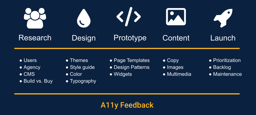
Here are some of the top ways to include accessibility across the research, design, prototype, content and launch phases of a website build or redesign:
Research
- When defining your target audience, include a variety of users who have disabilities – including those that are temporary, situational and permanent.
- When evaluating design agencies, look for those with accessibility expertise.
- Find a CMS that has accessibility features and tools for content creators.
- Determine if you want to buy an existing theme that is accessible or have the agency build your own accessible theme.
Design
- Incorporate inclusive design best practices into your theme.
- Include accessibility considerations into your new digital style guide.
- Ensure that your brand colors have good contrast.
- Select fonts that will be easy to read.
- Get accessibility feedback on visual comps.
Prototype
- Start to review HTML code used for templates and widgets.
- You can use a tool like Jira’s Issue Collector to log Jira tickets directly on the page you’re reviewing.
Content
- Once the page templates were built, you can start to use those templates to add your content to your site.
- Ensure that images uploaded to your Media Library have image descriptions and multimedia has both audio descriptions and captions.
- Provide training and a user guide for our content creators so they know how to publish accessible content.
Launch
- Prioritize fixing the accessibility barriers that are the lowest-hanging fruit – these are the barriers that will be the easiest to fix and have the biggest impact on the user experience.
- Work through your backlog.
- Maintain accessibility by periodically reviewing new content to ensure it’s following guidelines and best practices.
10 accessible design considerations
We’ve pulled together the top 10 key design details for you to consider, with real examples of modern and engaging experiences that work better for users of screen readers, keyboard users, and sighted users.
1. Accessible = aesthetic
The myth we’ve heard time and again is that an accessible website must be boring and sacrifice aesthetic appeal. This is simply not true. An accessible site doesn’t have to be basic, aesthetics don’t need to be sacrificed, and there is a lot of overlap between good design and accessibility best practices.
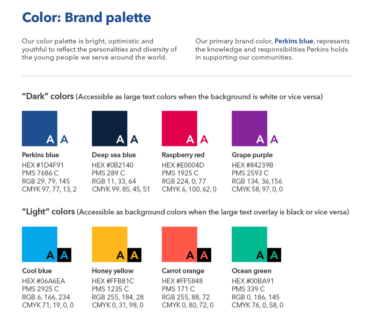
2. Brand palettes
Did you know you can have a bright and fun color palette and still be accessible? Be intentional with your color choices and provide variety to fit multiple situations and retain visual interest across your pages.
Take a look at the Perkins School for the Blind color palette. It is bright, optimistic, and youthful to reflect the personalities and diversity of the young people the organization serves around the world. The colors are categorized into “Dark” colors, like deep sea blue, that contrast well with white text and backgrounds and “Light” colors, like honey yellow, that contrast well with black or very dark text and backgrounds.
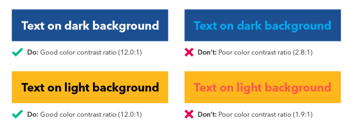
3. Color contrast
Poor contrast is the number one accessibility barrier on the web today. Color contrast not only benefits people with visual impairments, but it also is beneficial when there is a glare from the sun or an older device with less brightness in use.
There are a lot of great tools that measure the contrast ratio between foreground and background colors. To meet the Web Content Accessibility Guidelines you should have at least a 4.5:1 contrast between colors for regular sized text. For the Perkins sites, we customized the colors in the content management system and removed colors that didn’t provide enough contrast. Take a look at an example of color contrast from our brand graphics guide to see the dos and don’ts.
4. Typography
A clean, clear, and readable typeface is critical, but that doesn’t mean you can’t choose a modern font that is both accessible and attractive.
At Perkins, we knew we wanted to select a sans-serif font, which means the characters don’t have the small strokes that protrude off the end of a larger stroke. We also stayed away from fonts with extra, decorative elements. When serifs and decorative elements are scaled down, they tend to blend in with the rest of the letterform, making it harder to identify.
We chose Avenir Next after researching multiple use cases, like visual impairment and dyslexia, because even though it is quite geometric, it has humanist width and height variations that make letterforms more distinguishable. Another font consideration is to make sure users aren’t forced to use your font. Some users may wish to go into their browser settings to select their own font or use a browser extension to view the web with their selected font. Providing that flexibility can be beneficial to many people including people with dyslexia.
5. Visual hierarchy
Visual hierarchy is a visual design principle which designers use to show the importance of each page’s (or screen’s) contents by manipulating the size, color, contrast, alignment, and white space in the design.
We wanted to make sure the hierarchy implied by the visual design could also be translated to a screen reader. In some of our page templates we wanted to visually emphasize a subheading under the page’s main heading, which was styled in what we call an “eyebrow” text format. The eyebrow text is a clear description of the page’s main content and it is also the title of the page and the link that is clicked to get to that page. Even though the eyebrow is visually smaller, we still made it the Heading 1 in the markup so that it was identified to screen reader users as the main heading on the page.
6. Link styles
Many designs on the web these days are no longer underlining links, which can make it difficult to know what is clickable, especially if the link colors do not have good contrast with surrounding static text. We wanted our links, especially our call to action (CTA) links, to stand out visually, so we gave a lot of thought to the design and color choices for link styles.
We decided to underline our links so that it was clear what was clickable. We also used yellow as another visual cue as to what was clickable on the page and we made sure that the yellow color that we used had a 3:1 contrast with both white and dark blue backgrounds.
Another consideration for links was to avoid generic link text like “Explore,” “Learn More,” and “Discover” and to use meaningful link text that, out of context (i.e., when a screen reader uses a link list), would still be useful. Meaningful link text is also good for SEO!
7. Focus and hover states
We often see no consideration given to focus styles, which is a lost opportunity to reinforce click-ability, emphasize your brand and make calls-to-action pop.
We added some design elements and color choices to our focus and hover states to ensure we covered the experiences of both keyboard and mouse users. For example, when you bring keyboard focus or hover over one of our services, the size of the clickable area grows slightly and displays a border around the element. In addition, the underline from the link disappears and is replaced by a yellow background behind the service name.
8. Click targets
When we built our Knowledge Center, the resource cards include a featured image, resource title, CTA, short description, and category tags.
Rather than making each individual part clickable, we grouped them together to make the whole card clickable. Providing a large touch target makes it easier for those with mobility disabilities, but it is also more mobile friendly for all users because it takes the guesswork out of where to click. It also reduces the cognitive load for screen reader users, because instead of hearing multiple links for a single resource, they only hear the most important information (the resource title) once.
9. Photography and iconography
Accessible websites can include all types of photographic images and graphics to add visual interest. We suggest choosing images with clear, well-lit subjects and cropping images to reduce clutter.
One thing we avoid is overlaying text on images. When you overlay text on images, there often isn’t enough contrast for readability or the background is too distracting for good legibility. Even if you find the perfect image, when you need to update the page, it’s hard to find another image to fit that spot.
Adding alternative text to your images is an important part of accessibility and should be a baseline requirement for all of your content. Providing an image description is also good for SEO. But not all images need to be described. In fact, describing decorative iconography or graphics can become audio overload for screen reader users. What is a decorative image? In other words, their primary objective is to be a visual interest support rather than adding to critical messaging.
10. Mobile optimization
Most visits to your website are very likely going to come from someone using a mobile device, so it’s important to ensure that your theme works for devices such as smartphones and tablets.
In our design, we followed a “mobile first” philosophy, which means that we designed for mobile devices first, then saw how the designs could be translated to larger screens. This really forced us to focus on simplicity, which benefits all users, including those with disabilities.
All of our pages are responsive, meaning the layout adjusts and content reflows based on the width of the viewport. Having a responsive website also improves the experience for people who use zoom to increase the text size on a larger viewport, which often triggers the mobile responsive layout. We made sure to test with both mobile devices and desktops.
Get started
We hope we’ve proven to you that accessible design and beautiful design go hand-in-hand. The next time you hear that accessibility is going to mean design will be sacrificed, share this resource – because if your website isn’t accessible, it isn’t as beautiful as you think it is.
If you want to continue learning about digital accessibility from Perkins Access, sign up for our monthly newsletter. Once a month, we share the latest news and best practices, so you can stay up to date.
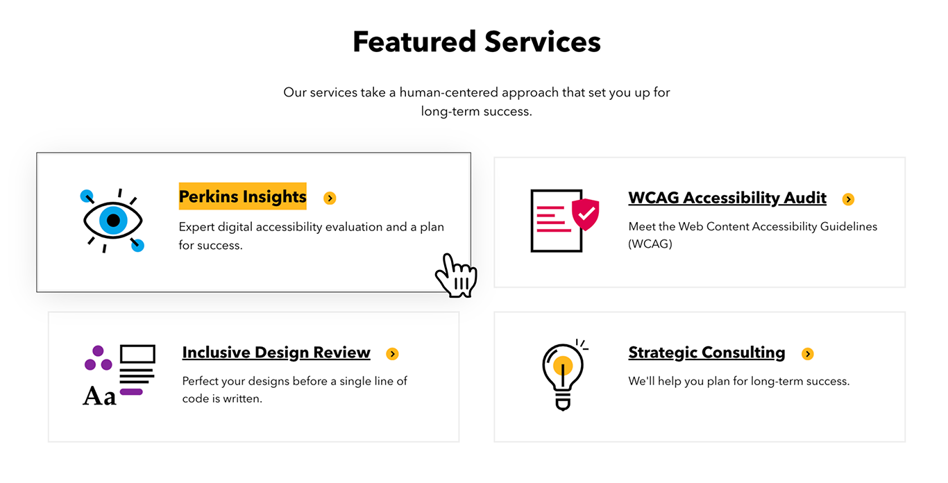
Work with Perkins Access
If you’re ready to begin improving digital accessibility at your organization and you need support, contact us to get started. Perkins Access partners with organizations of all kinds to help them create digital products, services, and experiences — websites, apps, multimedia, and beyond — that engage and include all people, regardless of their abilities.
Our services take a human-centered approach that sets you up for long-term success. Learn more about how we can help you:
- Strategic Consulting – We know what it takes to make accessibility work in the real world: A holistic approach and a realistic plan.
- Perkins Insights – We’ll identify your most critical accessibility obstacles and tell you how to improve your user experience.
- Digital Accessibility Training – Role-based training for your organization, because getting digital accessibility right takes a team effort.
- Inclusive Design Reviews – We’ll help you establish guidelines, avoid mistakes, and plan for a successful development process.